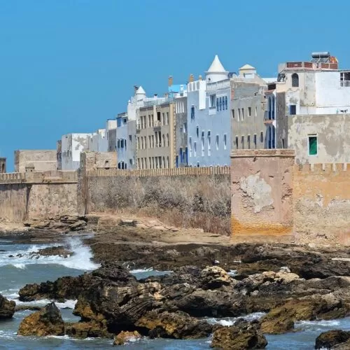
noblexplorer is a travel agency who offer their customers unique, authentic experiences, designed in the most inspiring surroundings. All of their itineraries are tailored-made to the needs of their customers creating long-lasting, memorable moments. noblexplorer approached juba web to create and design a website that reflect the high-end service they offer. They have many aspects to their business which were confusing to navigate between. We took on the challenge and set out to deliver an industry-leading, beautiful website that portrays the brands premium feel and offline experience. The user experience was our first stop for the website. Through our extensive research process, we established that whilst the site has quite a niche, the way they browse is extremely varied. Some only knew the destination, some only knew the type of holiday and others weren’t sure of either and wanted A&B to inspire them. We tackled this with clear landing pages for each user journey all of which end with a detailed itinerary of their chosen experience. We also add a ‘filter by’ option where the user could provide noblexplorer with detailed information about the experience they were after. From a design perspective, minimalism is key, so we kept the color palette as light and neutral as possible, with the amazing photography from their experiences being the main driver.
noblexplorer approached juba web to create and design a website that reflect the high-end service they offer. They have many aspects to their business which were confusing to navigate between. We took on the challenge and set out to deliver an industry-leading, beautiful website that portrays the brands premium feel and offline experience.
The user experience was our first stop for the website. Through our extensive research process, we established that whilst the site has quite a niche, the way they browse is extremely varied. Some only knew the destination, some only knew the type of holiday and others weren’t sure of either and wanted A&B to inspire them.
We tackled this with clear landing pages for each user journey all of which end with a detailed itinerary of their chosen experience. We also add a ‘filter by’ option where the user could provide noblexplorer with detailed information about the experience they were after.
From a design perspective, minimalism is key, so we kept the color palette as light and neutral as possible, with the amazing photography from their experiences being the main driver.
